JIGGLY ZONE
by
Sylvie and Hubol
Windows/Free/~3 hours

"Welcome to the JIGGLY ZONE. Become JIGGLER and find the Medallions scattered Throughout the land."

I came to this one through the repeated, insistent recommendation of Blake Andrews, Babycastles veteran and longtime contributor to Glorious Trainwrecks, the online home of trashgames and B-games. I wasn't previously aware of the works of Sylvie and Hubol, but they have been prolific producers of free games for the last ten years, always in a B-game style.

Designers of free games don't organize neatly in genres or movements, so probably it's a bad idea to apply terms like 'B-game' or 'trashgame' or 'kusoge' to other people's work. Maybe the easiest way to explain a game like JIGGLY ZONE is to say that for the last ten years, a small set of game designers has resisted the virulent, near-total commercialization of independent games. When you set out to make a videogame you can sell for money, you implicitly accept a large set of norms and orthodoxies around value and quality — for example, commercial games have to look and sound attractive. All the art and sound in them must be original. A commercial game has to be of a certain length relative to its price. It has to be accessible and easy to understand. Most broadly, commercial videogames are not allowed to be terrible in any one dimension... and this comes at a steep price, which is that they are usually not brilliant in any one dimension, either.

When B-games are ambitious, which they often are, they tend to be ambitious in a way that is laser-focused on one single element. This lightness allows them to pursue that one element, be it a mechanic or a concept or a joke, in a way that is forbidden for commercial work.

Here, then, is the reason why you should play JIGGLY ZONE: unencumbered by the need to do everything, it does one thing — level design — to perfection. I loaded it up with a degree of apprehension: do I really want to play another masocore 2D platform game? And then, in spite of myself, I was seduced by the virtuosity in the placement of the blocks and hazards, and the way they give life and depth to the game's action mechanics.
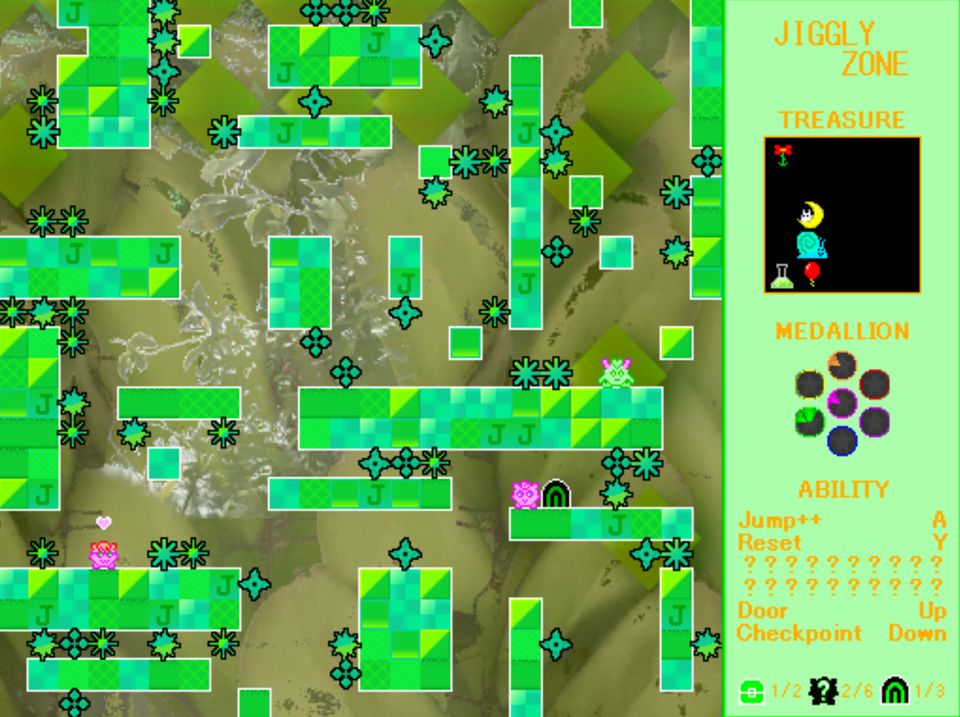
JIGGLY ZONE has a very simple and familiar structure: you are given a nonlinear 2D world to jump around in, and you must collect a bunch of treasures, most of which are squirreled away in places that are hard to jump to. Some of the treasures grant additional powers of traversal, in that familiar Metroid-inspired way, and the game also provides one generous gift from the outset, which is that you can place a checkpoint by pressing the down arrow whenever you are standing on solid ground. The cadence of play, as a result, is rapid staccato repetition: you line up a jump that looks difficult but feasible, you place a checkpoint, and then you attempt that single jump over and over again until you get it right.

JIGGLY ZONE's world is made up of just two types of objects: deadly blocks and solid blocks, and so the substance of the game is just the particular placement of these blocks in each level. At first glance, the placement seems haphazard and almost random. But as you inch through the world, placing checkpoints and forming hypotheses about which jumps are makeable and which are not, you realize every single block has been placed with great care and ambition. The level design starts simply enough but it progressively guides you through the details of the mechanics with a level of granularity I have never seen before: how high is my third double-jump? How much height do I lose if I jump into the ceiling? By the end of the game, it has become the most technical and original platformer I can remember playing, but it is all in the arrangement of the blocks.
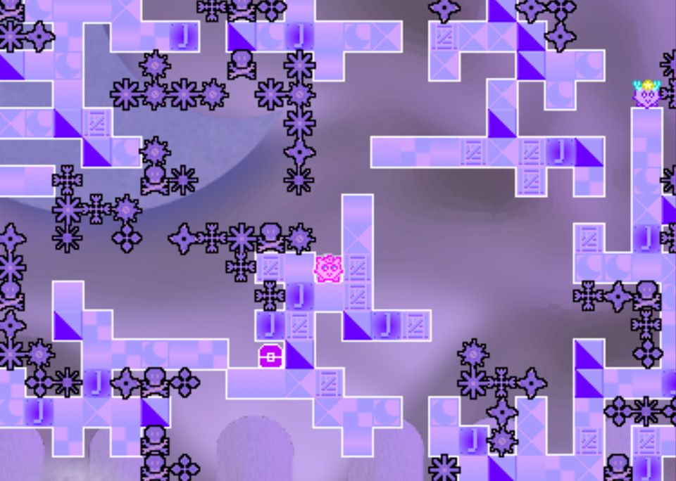
I've talked about invisible forms of beauty before on this blog, when I wrote about the puzzle design in Mirror Drop. JIGGLY ZONE has a great soundtrack, but it is a visually hideous game, with a character borrowed from Pokémon and no appreciable story, no high concept, no sense of place. Still, as I worked my way through the game, finding the hidden loopholes and tricks that made impossible obstacles just-barely-possible, I felt that same sense of awe and joy that I feel looking at masterpiece paintings or listening to favorite records.

Invisible beauty, encoded in the virtuosic placement of two types of pixellated block.
Kuron and the Jelly Islands (クロンとゼリー)
by
Tatsunori Ishibashi
iOS/android/free with ads

"A simple action physics puzzle game where the black cat's "Kuron" is active!"

I found this through the twitter feed of Daisuke 'Pixel' Amaya, who was tweeting strategy tips for it in Japanese (to be clear: I don't speak or read Japanese, but twitter is much more enjoyable if you don't read the text of people's tweets, anyway). I think a lot of interesting games for phones are coming out of Japan right now — I would also direct you to check out Yoshiro Kimura's recent work, including Million Onion Hotel.

My friends often complain to me that nothing good is coming out on iOS or Android anymore, and I think this impression comes from the fact that the top charts do not rotate that much, and there aren't many good places you can go to read about original, interesting work. The phone stores also have an extreme power law of distribution, such that if you only look at what's popular, or what gets featured on the front page of the store, you're looking at 0.1% (at best) of the games that come out. There are countless wonderful games released every week that get only a handful of downloads.

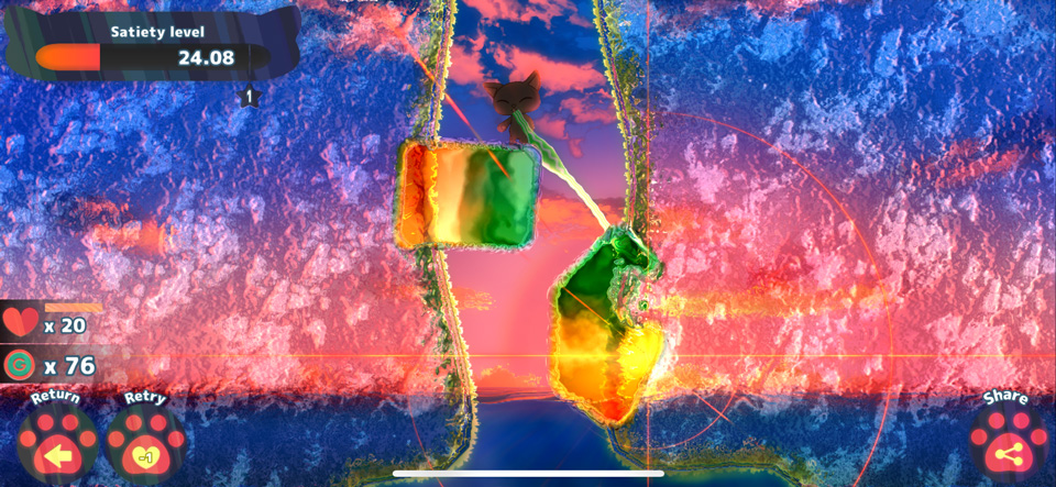
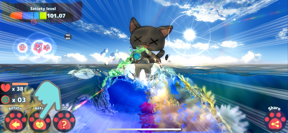
So let me pitch you Kuron and the Jelly Islands, a game from the bottom nintety-nine-point-nine: It's a game about a cat who sucks jelly through a straw. It is probably the most joyfully idiosyncratic thing you'll play this decade.

kuron2

In Kuron and the Jelly Islands you are a black cat ('Kuron') standing on a jelly island sitting in the sea. You're hungry and your job is to guide Kuron's straw around the screen with your finger, eating as much jelly as possible without eroding the platform to the point where he drowns in the water. At some point, you declare that you've sucked as much jelly as you can safely suck, and you ask the game for a grade.

Puzzle games come in a wide range of flavors, and you can divide them up a lot of ways. Puzzles can be fast or slow (compare Zuma and Dots, for example), they can be 'tight' or 'loose' (compare The Witness and Fidel), and they can be neat or messy (compare Colorbind and Zen Bound). Puzzle games centered around physics scenarios tend to be fast and messy, and Kuron and the Jelly Islands might be the messiest puzzle game I have played.

For me a messy puzzle is not one that has a binary moment when it goes from unsolved to solved. Games like Crayon Physics and Zip-Zap are loose, because there are lots of solutions, but they are always neat because you either got the object to the goal or you didn't. In messy games like Piyomori or Wetrix, each action is a little bit good and a little bit bad, and you wind up with a score that is a little better than your last effort, but it's unclear whether it's the best that you can do. The feeling of playing messy puzzles is utterly different from playing a slow, tight, neat game — it resists thinking ahead and rationalizing and encourages intuitive, distracted styles of play. I like this, especially on a phone, where a tight and neat game often asks more of me than I am willing to give.

In Kuron, your progress toward the goal is analog, and the way the puzzle reacts to your actions is enormously analog too: the platform of jelly wobbles and stretches with every piece of matter removed from it, unpredictable and highly dependent on timing. A good strategy might be a risky one, that takes a few tries to get right. And you probably never feel like you did the best job you possibly could have. I like that sense of lingering anxiety, knowing you never quite finished a level with no mistakes, no mess.

kuron3

I'm really enjoying solving the puzzles in Kuron, which start trivial and quickly ramp up to interesting and even fiendish. But if I'm honest, a lot of what attracts me in this game is the aesthetics. There's a new visual style just starting to emerge globally, a kind of rainbow-hued shader-maximalism that evokes late-1990s shareware aesthetics. I'm fascinated by visual approaches that achieve beauty through intentional bad taste, and this game takes that magic trick further than the others I've seen. The jelly wobbles and shines and refracts, like something 90s Kai Krause would have been proud of, and every part of it has a strange, skeuomorphic, alien physicality.

Subserial Network
by
Matilde Park, with Penelope Evans, BARCHBoi, and Sarah Mancuso, cooperating as Aether Interactive.
pc/mac/$10

"Join with the terminal and terminate defective synthetics."

This was recommended to me in person last week... but embarrassingly, I can't remember who recommended it. I have to start taking better notes! It's currently available in Humble's 'Trove', a collection of big and small games that are free to their monthly subscribers, and my guess is that it will be made available for sale to non-subscribers, around the start of September. So if you don't want to sign up to a subscription service, you can just wait a couple months. It's out now on Itch for $10.

Here's why you should play it: As Rob Fearon once put it, 'we're 30 years on from some genres and barely touching the sides'. Subserial Network is one of those short-form experimental games that gestures at the great untapped wealth of ideas that the medium of games is capable of, that suggests we are nowhere near touching the sides. It is a game about mutability that demonstrates the unprecedented mutability of the form.

subserial2

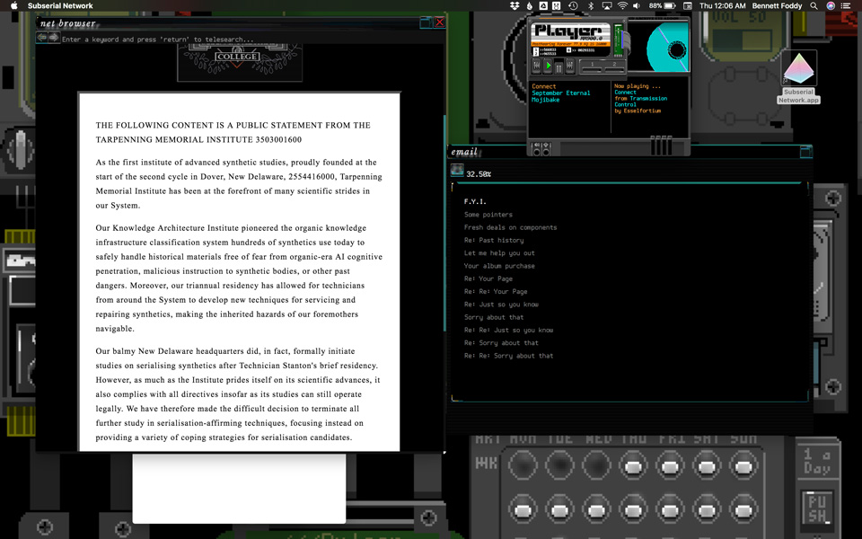
Subserial Network is one of those games that presents itself as a desktop application, paying homage to old multimedia experiments like the excellent 1996 CD-ROM classic Spycraft: The Great Game and of course to Christine Love's seminal 2010 piece Digital: A Love Story with which it shares a number of visual and narrative themes.

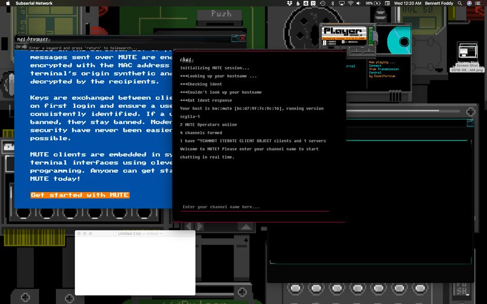
Park describes the game as a 'multi-window experience' but that significantly understates the radical nature of the design. We have lately seen a number of 'computer within a computer' classics, from Digital and Beglitched to Cibele and Her Story, but unlike those games, Subserial Network consists of various programs and files that live on your actual computer desktop, and the wallpaper in these images is just a suggested wallpaper image that they provide in the folder, that I applied to my own Mac desktop. In a way that goes beyond other experiments like Ivan Zanotti's horror game IMSCARED or Robert Yang's Hurt Me Plenty, it breaks that most inviolable of fourth walls, the boundary between the game and the rest of your computer. Games are fiction (which is supposed to stay in-world and in-character) but they are also software (which is supposed to stay obediently in its sandbox).

Thematically that is a perfect metaphor for the story the game tells, which is about characters who are driven to cross forbidden digital thresholds in pursuit of recognition and happiness.

subserial3

Subserial Network subtly tells a story about the optimism embedded in early digital culture; of the hope many of us shared that new, more parallel and anonymous modes of communication would yield more authentic, fluid identities and deeper and more empathetic modes of human connection. It uses the visual language of early digital protocols like BBS, email and Lynx, to evoke a sense of nostalgia for that utopian vision, even though the narrative is set in a distant posthuman dystopia. At the same time, it uses this setting to tell a second story about trans experience, alterity, gender dysphoria, and self-actualization, reframing human bodies as inherently constructed objects (which they are, sociologically, although we often forget it) by telling the story from the point of view of synthetic androids who still remember the physical assembly of their bodies. Of course, these two story threads do not read as orthogonal to each other — they are in ways the same story.

I spent a substantial portion of my teenage years connected to variously-queer gothic cyperpunk BBSes, and later I 'grew up' to become a person who makes internet memes for a living. And so, though I have no personal experience of the gender themes written through Subserial Network's story, there is an undercurrent of loss and disappointment in it that resonated very strongly with me, that flowed from the ways in which our shared optimism about the digital revolution has given way to a darker digital reality. It is a very sad flavor of nostalgia.

But beside that dark beauty, there's optimism in the collaborative vibe of this project, which has additional writing by Penelope Evans, a lovely, perfectly matched soundtrack by Sarah Mancuso and art by BARCHboi who made the lovely and strange DEOIS II: DEIDIA. And for me there's particular beauty in Park's & Evans' writing, which captures the desperation with which digital pioneers, so often othered in their non-digital lives, reached out into the ether.

Geez, looking back over this blog post, I really feel like you should play every game I linked to, all eight of them. But I promised to only recommend you one at a time, so this is the one for right now.